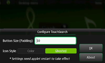
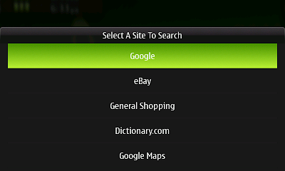
One of my favorite Desktop Widgets on my N800 was the "Internet Search" applet. However, I was disappointed to find out that it was being dropped in Fremantle and there would be no official replacement. Since I wanted to learn a little more about programming for Fremantle and something as useful as a Search Widget wasn't available, I decided to tackle both at once.
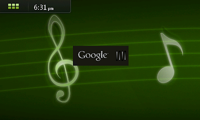
The widget is called TouchSearch, and it allows you to search the web right from your Fremantle Desktop. It has a decidedly different feel than the Nokia-made widget because of some of the Fremantle Desktop restrictions, but accomplishes roughly the same thing.
TouchSearch is currently in the extras-testing que and is in need of testers! So, if Touchsearch sounds useful, give it a whirl. The package page is here and it contains a link to the bugtracker if you find issues or want to request new features. Please leave a thumbs up/down if you test it (packages need to have +10 karma to be eligible to be promoted to regular extras). Thanks!
Here are some screenshots on Scratchbox:
Saturday, November 7, 2009
Monday, August 24, 2009
Preview: Quick Clip 0.5.0
Some might think that since Quick Clip has not seen a major update in months, development has slowed or stopped with it. Quite to the contrary, though, Quick Clip 0.5.0 will debut with more features and contain more bug fixes than any version to date. So today I will outline some of the work that has taken place on Quick Clip.
Bug Fixes:
There have been quite a few nagging bugs or "oddities" that have been present in QC since piratically it's first release or introduced shortly thereafter. The main ones, to me, were:
- Disconnect between "Manage Files Dialog" and actual files on the device. By this, I mean that QC kept an internal list of files you had created and when , let's say, you would delete a file, it would just remove it from it's internal list. Never would it actually delete the file from your device. This caused a great deal of confusion, so in the last (public) version of QC I added a "Delete" option to each file's menu. Now this worked all fine and well, but it duplicated (missing) functionality in the Manage Files Dialog. So for QC 0.5.0, I completely rewrote the whole MFD backend causing it to behave exactly how one would expect.
- Handling of "stale" settings file. One of my major gripes with previous QC versions were their inability to handle old/stale settings files. Example: if you installed a new version of QC that had a different settings configuration (like more options), then QC would completely cease functioning until that settings file was removed. This caused me to write some code into the postinst script that deleted the current settings file on your device every time you upgraded. This, admittedly, was a horribly sloppy solution. QC 0.5.0 introduces seamless stale settings file handling. In a netshell: it detects if the file is stale, and if it is, it resets it to a factory-default state.
- History is now persistent. In my mind History was never that useful because every time the device got shut down, it was erased. In QC 0.5.0, the History is now shutdown-persistent. But don't worry, there is a clear button.
New Features and Functionality:
Yeah, I know bug-fixes are exciting and all, but what you really came here to see was the new features in QC 0.5.0, right? Well, if you did, then you cam to the right spot:
- HTML support. If you've been following QC since it's initial release, then you know I've been talking about HTML support since day 1. Well, it's finally here, and it turned out pretty nice, I think:
- You can easily select which format to use (.txt or .html) in the revamped MFD (Manage Files Dialog), see:
- The addition of the HTML format allowed me to add additional features to QC, namely the ability to take screenshots and clip them into files. There is also the option to select either a fullscreen screenshot or windowed one.
- I also decided to make QC more finger and thumb friendly by having an option to increase the size of the menu entries:
- I also revamped the Settings manager to feature a simple tabbed interface. Although this is in direct conflict with Fremantle's HIG (more on Fremantle later), it seems to be the most efficient way to display many things in a single dialog window. It makes you wonder why, with everybody going to tabbed interfaces, the Fremantle HIG's recommends against them (additionally, the gtk.Notebook is one of the few finger-friendly widgets out-of-the-box e.g. no modifications needed).
- Also debuting in 0.5.0 is a highly-experimental web server -- which allows you to (theoretically, largely untested) access your QC files from any computer by inputting your tablet's IP address and the required port number into the computer's browser. Once you do that, as long as you started the server on the tablet end, QC serves out a web interface. A little bit shown below:
That about sums up the major new features in QC -- of course, I also have fixed more subtle bugs, optimized certain expects (making QC as a whole faster) and rewritten much of the behind-the-scenes code.
Fremantle Support:
I was really hoping to ship full Fremantle support in this version of Quick Clip, but unfortunately that doesn't seem like it is going to happen. Since the Beta 1 of the Fremantle SDK didn't support Statusbar plugins, I lost time waiting for Beta 2. Now that Beta 2 supports them, I needed to wait for the Python team to create bindings for them. That is apparently underway (or even largely complete) but I'm still waiting on API documentation (see bug 4936) so I know how to use the bindings. Yes, quite a logjam. So to date, only Quick Clip Viewer has any type of Fremantle support.
Release Time Frame:
I'm hoping to release it before Sep. 8 (when my classes start), so stay tuned!
Tuesday, June 16, 2009
Presenting: Google Colors, a whole new Google experience.
Have you ever gotten tired of the plain, boring, bland Google Search page? Doesn't blue on white get old after a while? If so, then check out Google Colors: it spruces up Google with 5 different color combinations. You'll never want to use the plain old Google again.
Below are five different links taking you to a whole new Google Search experience. Remember, same great Google Results and layout, just with a bit of style.
Google Chocolate is a light-on-dark spin to the traditional Google. This is perfect for those that prefer light text on a dark background, myself included. Never endure an eye-burning bright background again.
Google Waves has a soothing light blue background to fit into an overall beach-like theme. Sit back and relax while searching the Web.
Why shouldn't Google be just as stylish as the clothes you wear or the handbag you carry? This is Google with a serious infusion of girly style. Enjoy purple on pink. Why would you ever use anything else?
With homes, cars and just about everything these days going green, shouldn't Google? Google Forest offers Google in a Earth-aware light green background and relaxing earth-tone colored text.
What happened to the days of the nice old-fashioned monochrome displays? All you see now is these multi-million color capable screens, when all you want is a little retro nostalgia. With Google Grayscale we want to brind you back to those times. See the world through eight colors just like you used to.
Tip: If you like one of these new Google looks, then remember to set it as your browser homepage. That way, you can always have it right at your fingertips, whenever you need it.
Do you want to see Google Colors in action? Check out the video below!
Friday, April 24, 2009
Personal Information Management Revisited: Quick Do?
I am one of those (seemingly many?) people that migrated from a Palm device to a Nokia N8X0. Being a longtime user of the Palm OS platform, I grew accustomed to some things being built right in to the platform e.g. the Palm PIM suite (Calendar, Tasks, Notes, Memos, Contacts). Although all of the PIM applications were really nice, the one I always found myself using most was the Tasks application.
I always thought a Calendar was a little strict (and extremely time-intensive to keep up) for my needs, and something like a plain-text memo-like reminder was too far the other way. Tasks was just perfect. Structure with compromise.
When I first got my N800, I was disappointed there was no Palm Tasks-like application. I've tried them all, and none were up to the task (no pun intended).
Recently (actually, like just the last couple days) I looked into programming my own solution. At this point it is merely a mock-up: no data storage, no functionality, no killer features (or features at all), but it presents the concept of my ideas.
I call it Quick Do (and no, it may have the same Quick prefix, but it will not be integrated in Quick Clip).
Here is the proposed main view: (also showing future filtering options)
And the Add Task dialog:
The Date selector:
Will this turn into an actual application, probably (after battling with the gtk.TreeView widget for hours already, I would hope so!). But more importantly, what do you think of the interface? Finger-friendliness is out-of-the-question, but anything else? I have a laundry list in my mind of features that could be added, so a little direction is welcome.
Feel free to leave comments below.
Friday, April 17, 2009
Quick Clip 0.4.1 Released.
Today I'm pleased to announce the release of Quick Clip 0.4.1-1. What is Quick Clip? Quick Clip is the combination of a statusbar plug-in and text viewing application specifically designed for the Maemo platform. The statusbar plugin allows you to "clip" highlighted, or enter text directly, into a plain text file for later reference. While the text viewer easily allows you to read and/or access data you've already clipped.
New features in this release are:
* Added Clear submenu item
* Added Delete submenu item
* Switched to XML for target file list storage
* Switched storage location for user files
* Major code cleanup * Fixed Open Bug
* Fixed preinst script
* Renamed Open Settings button to Browse
* QCV: Changed preference warning to bold
* QCV: Added application menu
* QCV: Fixed bug in scrolling choice
* QCV: Added Select All option
* QCV: Added Right/Left buttons for flipping through clippings
* QCV: Added Properties submenu item
* QCV: Added Help menu item
* QCV: Mapped the +/- keys to increase/decrease font size
* QCV: Mapped the Up/Down D-Pad keys to scrolling (only for GTK)
* QCV: Changed Title (more path visible)
* QCV: Major code cleanup
Here are a few screenshots from the new release:
Thursday, March 26, 2009
Quick Clip .0.3.0 Released
After a longer-than-expected wait, Quick Clip version 0.3.0 is available for download. New things in this version include a much improved help system (now integrated with hildon-help), and a builtin Quick Clip Viewer. Here is the full changelog:
* Switched to hildon.banner for information/warnings/errors
* Now has Open button in settings dialog for easy file navigation
* Now uses hildon-help for builtin help
* Simplified About Dialog
* Added Donations sub menuitem
* Initial release of Quick Clip Viewer (beta)
* Now packaged with dpkg-buildpackage
You can download the new version from my website here.
Friday, February 20, 2009
Quick Clip 0.2 Released!
Today I am happy to announce the release of Quick Clip 0.2. If you've been following along with Quick Clip's development, you'll know that I've been actively working to make it more robust and user friendly.
(skip down to the bottom of this post for the download link).
If you are unfamiliar with Quick Clip, here's a brief rundown:
Quick Clip is a statusbar plugin for the Nokia Internet Talets and maemo operating system that easily allows you to save off text data. Whether the text be something you want to jot down, or contained in a webpage, Quick Clip automates the whole process.
It just takes a couple of clicks to save off a peice of information. And best of all, with Quick Clip's easy to use interface and easy data categorization ability, you'll never misplace that information you wanted to save.
That said, there are quite a few new features in this release:
python2.5
python2.5-hildon
python2.5-gtk2
python2.5-hildondesktop
hildon-desktop-python-loader
If you have the Maemo Extras Repository enabled, this will install these dependencies:
Run in the Terminal, as root:
Now you can install Quick Clip like any other application.
Obligitory screenshots:
___
And finally, here is the download link: Quick Clip 0.2
Please report any problems, feature requests right here in the comments, or hit me up with an email (my email address can be found in Quick Clip's Help).
(skip down to the bottom of this post for the download link).
If you are unfamiliar with Quick Clip, here's a brief rundown:
Quick Clip is a statusbar plugin for the Nokia Internet Talets and maemo operating system that easily allows you to save off text data. Whether the text be something you want to jot down, or contained in a webpage, Quick Clip automates the whole process.
It just takes a couple of clicks to save off a peice of information. And best of all, with Quick Clip's easy to use interface and easy data categorization ability, you'll never misplace that information you wanted to save.
That said, there are quite a few new features in this release:
- You can now specify whether the Options/History menu appears on the top or bottom of your target files
- There is a whole new "Manage Files" dialog; gone is the editable wordlist in Notes. You can now use the Manage Files menu item to easily add, rename, sort, and delete your target files.
- I also considerably cleaned up the code (there still is a bit more work to do), so things should run quicker and cleaner.
- I've also heavily worked on making the installation more seamless. I don't think there will be all the upgrade problems we had last time.
- Quick Clip is no longer a beta, but a full blown release
- When using the Manage Files dialog, deleting or renaming files doesn't do anything to the files you have stored in memory. It just executes the appropriate action to Quick Clip's interface to those files e.g. if you have a file called "a.txt" in memory, and you rename it to "b.txt", then clip text in to "b.txt" this will happen: Quick Clip's link to a.txt will be removed, and b.txt will be created and the selection will get clipped into it. Thus, you will have any data prior to renaming a.txt still in a file called a.txt and any new data in a file called b.txt.
- Quick clip has still not been uploaded to the Maeno Extras repository, so dependecies will still have to be satisfied manually.
python2.5
python2.5-hildon
python2.5-gtk2
python2.5-hildondesktop
hildon-desktop-python-loader
If you have the Maemo Extras Repository enabled, this will install these dependencies:
Run in the Terminal, as root:
apt-get install python2.5 python2.5-hildon python2.5-gtk2 python2.5-hildondesktop hildon-desktop-python-loader
Now you can install Quick Clip like any other application.
Obligitory screenshots:
___
And finally, here is the download link: Quick Clip 0.2
Please report any problems, feature requests right here in the comments, or hit me up with an email (my email address can be found in Quick Clip's Help).
Hello World!
This is my first post in my new blog -- Brent's Tech -- and I just want to say welcome. This blog is dedicated to mobile technology, and more specifically focuses on the Nokia Internet Tablet series and the platform that runs on those devices (Maemo).
You're read here my thoughts, ideas, and development ramblings concerning Maemo and other mobile platforms.
I hope you enjoy your stay.
You're read here my thoughts, ideas, and development ramblings concerning Maemo and other mobile platforms.
I hope you enjoy your stay.
Subscribe to:
Posts (Atom)